Showing posts with label SCS Challenges. Show all posts

Monday, February 25, 2013

Thank you in greens ...

This little card is for several ladies at work that bought me a lovely bouquet of flowers a pretty card to acknowledge my 40th Anniversary with the company.  I thought their nice gesture deserved a hand-made thank you card and I hope this one fills that spot.


In order to complete the card I decided I would play along with this weeks Featured Stamper challenge over at Splitcoast stampers.  This weeks Star is Andrea Hayes, and this is the card I cased:  Birthday Texture by Andrea Hayes

Since I added some paper piercing (I always seem to forget about this nice technique and it can really add such a nice touch) I decided to include it in the Less Is More challenge as well. 

Thank you all for stopping by.
Carole

Sunday, July 15, 2012

The magic number three....


The card I'm submitting is the third one created for this weeks Less Is More challenge.  The second Saturday of the month at LIM is the One Layer Card and this weeks twist is to work in "threes". 

The card to the left is the final version of card number three.  I like how this one turned out so I'm not going to even pop over to LIM and see if someone has used the same set or had the exact layout. 

That's what happened to the first card which was three balloons and a sentiment.  Just before I went to post it I took a look at the other submissions and saw another card almost exactly like mine so I tossed it aside and started over.   

The second card was really cute too until I splashed water all over it and the ink ran.  That one had more than twice the piercing as the one above plus some dry embossing so I didn't even try to save it or redo it.  

The picture below is the same card as above which was taken before I added the faux stitching to the piercing.  I like the top version better even though the stitching didn't turn out very smooth.    


SUPPLIES:
Stamps: Bright Blossoms, Just Believe
Card stock: Whisper White
Ink: Lucky Limeade, Real Red, Stazon Black
Bling - SU! rhinestones colored with Sharpie marker


Thank you so much for stopping by and I'll be playing catch-up on comments from last weeks challenge as soon as I finish the chores I ignored this morning.  ;)

ETA:

This card was made for todays Featured Stamper challenge at Splitcoast and after I finished it I realized it worked for the LIM challenge as well.  :D


~Carole


Friday, June 29, 2012

Piecing and Frosty Cupcake

This weeks Less Is More challenge was paper piecing and for me, that really was a challenge.  I struggle with piecing because I just plain suck at cutting things out by hand.  However, though this card isn't fancy or awe inspiring, I am very pleased how it came out.  :)


This card is final result of three tries that I worked on over the week.  The first one was flowers but it was too detailed so I had to abandon that idea.  The next one was a cute little duck with a hat and umbrella ..... awful is too mild a word to describe that disaster.  But thankfully this last one was easy enough that after a dozen tries I finally got that wrapper cut out perfectly.  YAY! 

The layout is from a really nice sketch challenge from SCS that was posted a few weeks back and I kept it in the back of my mind.  When the cupcake turned out so well I thought it should be the highlight of the card and this sketch was a perfect showcase. 

I'm posting this from work (no one is here yet) and will be very busy tonight visiting all the other blogs later this evening.  Thank you for stopping by.


Stamps: SU Crazy for Cupcakes; Teeny Tiny Wishes
Cardstock/paper: SU White and DP (unknown design it was from the scrap bin)
Ink: Stazon black; Melon Mambo
Embellishments/tools: Cuttlebug EF; Spellbinders Oval dies; Stickles glitter and pearl accents; Kaisercraft rhinestones. 

Sunday, February 5, 2012

Happy Anniversary Less Is More!!!


This week marks the first anniversay for my favorite blogspot challenge, Less Is More. The very fist LIM challenge was a color challenge so this week the Divas' have selected a color challenge to honor the anniversary. Their color choice is Aqua. Since I don't have a anything that is actaully labeled "aqua", I went with my "best guess" or in other words "this kinda of looks like aqua".


My best guess lead me to one of my all time favorite SU colors, Cool Caribbean. It was on the very first "In Color" group a few years back and I really hated to see that one go. Pulling out the CC really inspired me this week so I have three cards to share. This first one is my favorite and is actually for LIM and SCS Featured Stamper Challenge.

I love how this one turned out, and as usual I don't think the picture does it justice. The subtle blue shading on the raised embossing shows up very nicely in IRL; and completely missing from the picture is the beautiful shimmer that covers the entire card. At first I wasn't too thrilled with the black ink for the sentiment but everything else I tried looked far worse so I settled on the black.

This next card is very CAS. At one point I had a CC layer under the main panel but it was distracting and took away from the simplicity of the overall card; so I quicly dumped that idea. I might have ... just a little bit ... gone overboard on the bling but this stamp screamed at me ... non stop ... to add more, so I complied. Plus I'm addicted to bling. LOL


This last one is my least favorite. It is lacking in some way, but I just can't figure it out. I only just finished this one so maybe tomorrow I'll see what it is, or change my mind and like it. :D


Thank you kindly for stopping by.


Supplies:
Butterfly:
Whisper White, Cool Caribbean card stock; Cool Caribbean and black ink; Memory Box Die; Sixxiz embossing folder; Kaisercraft rhinestones; Smooch - Vanilla.

"thanks"
Whisper White textured card stock; Cool Caribbean ink; Wedding Sweet and Thank You Kindly stamps (SU); Kaisercraft rhinestones

Flower Heart:
Shimmery White and Cool Caribbean card stock; Cool Caribbean ink; Memory Box die; Just So Sayings stamp set (SU); Kaisercraft rhinestones.

Sunday, January 29, 2012

Heart Box

My it feels good to get back into my craftroom and make something. I have not made a project since December 11th. If I went into my craft room at all over the last 7 weeks, it was to stand there and stare at the complete chaos that making Christmas cards had produced. LOL

So I guess if one is going to head back into ones craft room, then why not tackle something new and big; my first ever 3D project.


After 15 years of having no one in my area to craft with, I have met a fabulous lady named Linda Keal who is not only fun and full of energy, she is super creative and loves to share. Another of Linda's fabulous traits is that she is not afraid to take on new projects or try new techniques. So this week when the Splitcoast news letter had a tutorial for a heart box made with Spellbinder dies, Linda and I decided to give it a try using the SU! dies. The SU! die is bigger than the SB so we had to make adjustments along the way, but the box above is the final result. I used only SU products on this box which is super rare for me.

I could not have made this box without Linda's help, so thank you friend, I really enjoyed spending the time with you. :)

I'll be heading back into the craft room to make another box and this time I'll take some additional pictures and jot down measurement since it is different from the SCS tutorial. I'll edit this post once I get everything done.


Stamps: Rue Des Fleurs
Paper: Soft Suede; Very Vanilla, DP Attic Boutique
Ink: Pool Party, Soft Suede, Tempting Turouoise (flower edges)
Accessories: Heart Die Set; Sizzlits dies Lots of Tags, Little Leaves; Embosslits Beautiful Butterflies; Scallop Punches (1.34 and 2.38); Smooch Vanilla shimmer (flower); basic pearls; antique brads (flower center); Victoria Lace

Friday, December 2, 2011

Pear Pizzazz Trees


This card is for SCS Color Challenge #351 (Pear Pizzazzz, White & Craft) and my final submission for Less Is More #43 (A bit of bling). This little card has left behind heaps of destruction. It has been torn apart at least half a dozen times since Tuesday leaving fallen scraps of paper, bling and embossed trees littering the floor around my table. Unfortunately I dropped my Cuttlebug machine and it landed on the handle and the whole thing came apart. I managed to snap the casing back on, but nope, it's definitely broken. :( I still have the Big Shot but must admit that I prefer my smaller CB. Oh well, the plus side is that now I have a bit of space for something else. Silver lining and all .... gotta love 'em.

About the card:
The card stock is SU!s retired Kraft and 2011 In-Color Pear Pizzazz. Sentiment is SU!s Teeny Tiny Wishes stamped with Early Expresso. The trees are a die and embossing folder set from Cuttlebug that is made up of three trees and a Santa shaped like a tree. The lovely bling is by Zva and the puffy snow is Liquid Applique.

It think that covers it. Thank you for stopping by and I hope every one has a great weekend.

Carole


Monday, November 21, 2011

It's Black or White ... no gray areas


This lovely little card is for the Less Is More challenge (#42) which is to make a silhouette card. I started this card on Sunday with the "fall" stamp from this set but could not make it work. Then this morning at SCS the CAS challenge was to make a Wintery card and that sent me in a different direction for the LIM card; I used the "winter" stamp from this set and wow ... finally got it to come together.

Not really much to this card: the stamp set is from CTMH, the paper is SU!s Whisper White and Basic Black; the ink is Varsafine Onyx Black (love LOVE this ink pad) and the embossing folder is an old one from Cuttlebug. Though it doesn't show up in the picture, I went over the image with my black Spica Glitter pen and it really added a lovely subtle sparkle to the silhouette.

On to the old ......

This next card was supposed to be for last weeks LIM challenge which was OLC week with the added instruction to use leaves. Unfortunately I didn't get home in time on Friday to post it. :( This card started out as a test (black was the closest pad on hand) but I liked it so much I decided to throw caution to the wind and make black leaves.


The stamps are my first from Paper Trey Ink; the paper is SU! Whisper White the ink is that fabulous Versafine and SU! Real Red. There is layer of fine black glitter over the leaves and last, my much loved Kaisercraft pearls.

PS - Those ultra fine glitters .... they get everywhere!! No matter how careful I was, that stuff just would not be contained. I swear those little glitters have legs and wings. LOL!!

Thank you for stopping in. It will be a slow at work this week (finally) so I hope to get in a lot of card making. Plus I'm looking forward to checking in with all my favorite blogs.

Carole

Wednesday, September 21, 2011

Come on autumn!!!


This card is for Week 33 at the Less Is More Challenge. Chrissie and Mandi have given us a "free of all" challange which is make whatever we want as long as its CAS. Yeah!!!

So this one is pretty simple and I got the inspiration for the Clean and Simple challenge over at Splitcoast which is to use leaves.

There are almost a dozen colors in those leaves which I watercolored using the tops of my SU! pads. Love watercoloring that way.

Thank you for stopping by.

Stamp: Memory Box Brilliant Maple Branch
Card stock: Whisper White and Lucky Limeade
Ink: Chocolate Chip Craft, Baja Breeze, Always Artichoke, Lucky Limeade, Certainly Celery, Really Rust, Dusty Durango, Marigold Morning, Tanferine Tango, More Mustard, So Saffron and Crushed Curry (which I used last to paint each of the leaves)
Embellisments: bakers twine, wood button by Kaisercraft

Monday, September 5, 2011

i miss shoe .......


This card is for todays Clean and Simple challenge at Splitcoast stampers. The theme was "shoes".

I've had this Uptown Design stamp for ages and thought of it immediately when I saw todays theme. This if one of those rare stamps in my collection; it's seen ink many times. LOL

I copied the colors that are on the stamp label so I can't take credit for the lovely combination. If it were left to me I'd never use yellow; however I started making this card at 1:00am so I didn't feel like "thinking" about colors. :)

There are three layers to this card; the first is the base card, then a frame in Elegant Eggplant (though for the life of me I can't get it to look like anything other than black), followed by Very Vanilla for the main panel. I masked off a very loose rectangle and spounged on Daffodil Delight. I inked up the shoe stamp in Elegant Eggplant (making sure not to ink the attached sentiment) and stamped that into the masked area. I removed the mask and using the fine tip end of the Elegant Eggplant marker, drew in a broken line frame.

By time I finished coloring the shoe it was getting towards 2am. I stopped for a tea break and then I bravely picked up my clippers and cut out the shoe!!! I didn't mess up the image or lose a finger....miracles really do happen. LOL

I attached the shoe to the top of the banner; then attached pop-ups to both pieces to give the card some depth and called it done. :D

I'm very pleased with this card even though its mainly yellow. Heck I'm so pleased I'm going to keep the Daffodil out and use it on another stamp project.

Sunday, September 4, 2011

Heavy Metal


This is my submission for Week 31 at the Less Is More challenge. This weeks theme is colour, more specifically, metallic.

"METALLIC - something that has a METALLIC finish to it... ink, embossing, card, charms, actual metal... "

This morning when I logged on to see what the LIM Divas had in store for us I was thrilled. I've had this fabulous fan for some time now and always knew I wanted to use it on a thank you card, but never really found a good layout. So after I double checked to make sure I could use it for this challenge, I flipped over to Splitcoast Stampers Sketch Challenge thread to see if I might find something to inspire me, no luck there. However I found this gorgeous card called Water Lily by Chris Dickerson who is this weeks Featured Stamper challenge.

I'm not so sure the Divas are going to let me get away with this one since I used a little more than half the white space up with DP; however I'm game to try again if this one gets the buzzer. :D

Thanks for stopping by and thank you for your comments, they are much appreciated.

Sunday, August 7, 2011

Dare To Get Dirty 2011

It's the annual Dare To Get Dirty Challenge at Splitcoast Stampers! It began last weekend and ends tomorrow night. I posted one of the challenge cards early yesterday, today I'm posting two more cards that I have completed which cover a combined 7 challenges. yeah!!


This first card is my favorite so far. I just love how the blue pops against the kraft; unfortunately the touches of blue in the DP don't show up very well in the pictures I took. It looks so pretty IRL.

The flowers are made from punched Baja Breeze; sponged with Baja Breeze and Pacific Point. I then spritzed the pieces with water and crumpled them up. After a few minutes I semi flattened them out, let them dry, then layered the flower together, finishing it off with some old SU! beads that were gathering dust. The DP is framed in Baja, then i distressed both layer and sponged the edges with BB and PP. The lovely wood frame is from Kaisercraft, the leaves are die cut using SU!s Little Leaves and the lovely seam binding is also Baja from SU. The kraft card stock and DP are from Memory Box.


The card above covers 4 challenges and I really had fun making this one. I rarely make masculine cards so I tend to struggle with them, but this one came to me fairly fast and though it will never be in my top 100 I am pleased with it. I'm especially pleased with how the globe turned out. I'm not sure how to explain this, but what I wanted was to give the globe a roundness or to have the center puffed out as if I cut a real globe. So using the large handle on my scissors and a soft pad, I stressed the image from behind starting in the center working my way to the edges with decreasing pressure as I went. Not sure if that made sense, but the result was what I was after. I tried to capture the "roundness" in the second picture, but it doesn't really show up very well.

I used SU! Real Red, True Thyme and cream naturals card stock. The inks were True Thyme and Early Expresso.


So there are two more submissions for DTGD2011 and if I'm lucky I might be able to make two more cards today and maybe even come up with something for the LIM challenge. :)

Thank you for stopping by.

Saturday, August 6, 2011

Eating Crow ...


This past week Splitcoast Stampers has been holding their Annual Dare To Get Dirty Challenge Week. Thirty eight (38) challenges over the course of a week hosted by current and past Dirty Dozen members. Its a fabulous way to spent a week especially if you are lucky enough not to work, or can take the time off. Unfortunately June/July/August are incredibly busy for me at work so I'm playing catch-up today and tomorrow. Needless to say I'll be lucky to finish maybe three or four challenges before Monday's cutoff, but if I combined a few challenges I might just get in a good 40%. :)

So now to the eating crow part:
I hate one layer cards. I suck at OLC. They never sparkle, say "wow" or even garner a "ohhhh". I never like the way they turn out and to be honest, I'm simply not talented enough to pull them off. OLC are the HARDEST to make in my opinion. So here now is a OLC that I just finished and for once, I absolutely love how it turned out. Its very plain but I think it works; more so IRL because the embossing doesn't stand out in the picture. So I guess I now have to say I suck at one layer cards 99.9% of the time. LOL!!

I embossed the image using SU!'s Chocolate Chip craft ink and clear embossing powder (lord only knows how I managed to get it centered); pulled out my re-inkers and colored away. Low and behold, the first OLC that I can truly say I like. :)

Thank you for stopping by, as always its wonderful to hear from old blog friends and new ones alike.

PS - Would have loved to have had this stamp for last weeks Less is More challenge; unfortunately it didn't arrive until yesterday.

Carole

Supplies:
SU! Faith In Nature
SU! Inkers: Pear Pizazz, Old Olive, Wild Wasabi, Sahara Sand, So Saffron, Early Expresso ...

Sunday, April 17, 2011

Not What I Was Going For ...


This card was supposed to be for todays Featured Stamper Challenge at Splitcoast Stampers; but this thing failed on a monumental scale so I won't be posting it. I don't want to insult the FS. LOL

I know it could probably use some pearls and a ribbon, but the ribbon was nixed because I could not find any pink that went with the card stock; and since the flowers were already a different color I thought three different shades of pink were pushing it.

I thought about adding a few of my much loved Kaisercraft pearls to liven it up, but decided I didn't want to waste them. I had a couple pearl stick pins coming from behind the flowers, but without a bow I thought it looked strange.

Maybe tomorrow I can take another try at this card. But for now this is it. It really needs help and any input is appreciated. :)

EDIT TO ADD:

I put two pearls on this card and now I'm happy with it. Sometimes I think I need to make a card, walk away from it for a day, then come back to it and look at it again.


Supplies:
Thanks For Caring set by SU!
SU Pink Pirouette; Very Vanilla; Basic Black card stock
Pink Pirouette and Basic Black ink
Spellbinders Fancy Labels and SU! Oval punches; Cuttlebug EF
Flowers by Prima (except the little off white ones; no clue where I came by those)
Kaisercraft pearls

Sunday, April 3, 2011

A Touch of Red


This card is for Week 9 of the Less is More blogspot challenge; Jules Sunday Snippets; and SCS Featured Stamper Challenge. This weeks theme at Less is More is to use a touch of red. The inspiration came from this card at Splitcoast Stampers Featured Stamper challenge. And once again I was able to use all scraps.

This is actually the second card I made for this challenge. The first card is an odd size at 3x6. It's not very good, but I can add it to my basket of give away cards and I'm sure one of my friends will snag it. :)

Not much to tell about this card; I used SU!s whisper white, basic black and real red card stock. The stamp is from SU!s Asian Artistry; the sentiment from Verve's Wordy Birds set; the oval punches are SU! and the edge punch is Martha Stewart. And of course, I had to have bling, so I added red Kaisercraft pearls to the bottom edging. I'm thinking about putting some glitter on the butterflies ....... I might try it on that small first card I made.

Thank you for stopping by; your comments are greatly appreciated. I hope everyone has a wonderful Sunday.

Carole

Friday, April 1, 2011

Card Making is Therapeutic

It feels so go to make a card. It's not a very good one, but I am thrilled that I was even able to concentrate enough to pull it together. :D

This card is for three challenges. The first is SCS Ways to Use It (use handmade flowers); the second is for Less is More and the third is for my lovely blog friend, Jules', Sunday Snippet challenge.

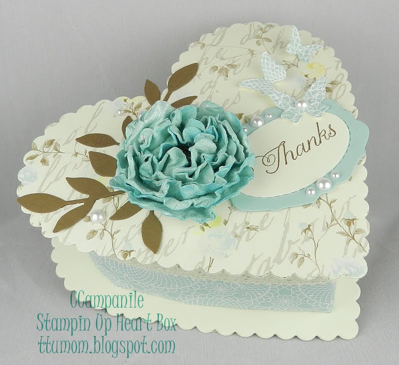
The handmade tissue flower is my first. I've admired them for some time but I think mine is a bit off; I might have used a bit too much tissue. The tissue paper comes from Verve; however, its not purchased, it's actually the paper Julee wraps the stamps in for shipping. Instead of tossing the tissue, I set it aside from my last two purchases to use for just this purpose. The tissue is very close in color to SU! Cool Caribbean (one of my all time favorite colors). After cutting and placing the brad, I sprayed the tissue with Smooch Spritz simmer, sponged some Tempting Turquoise and Pacific Point around the edges and let it dry.

The brad was in the bottom of my stash, so I don't know where it came from. The leaves are Certainly Celery edged in Pear Pizzazz; the strip with the sentiment is Cool Caribbean. The sentiment is stamped in Tempting Turquoise (I should have used the Pacific Point, but oh well); the embossing is one of the Cuttlebug folders and the punches were all Martha Stewart.

So this is my first card in weeks and every bit of it is from the scrap bin. Though its never going to make my personal top ten, I have to admit it was nice to actually start and complete a card, and most importantly, to "want" to make a card. :)


So for any that want to know why I have been away, here is why.
I was schedule to take a vacation the second week of March, but unfortunately I came down with another bout of Vertigo. Vertigo is not life threatening, but it does take me down. Watching TV or working on the computer is very hard. Something about the screens intensifies the dizziness, so TV was completely out and very little time was spent on the computer. There is nothing they can do, I just have to let it "run its course". GRRR.

Then on the 14th, I got a call in the middle of the night; my Dad who has been in assisted living in Oregon was taken to the hospital. Before my brother could get to him (my brother lives in Northern California where I am originally from) my Dad passed away. Because I can't get on a plane with Vertigo, my brother had to take care of everything. I feel so horrible to have left him to deal with that all by himself. To top it off, he had to deal with our older half brother, who is vile. Our half brother did nothing for our dad his last year of life, in fact added stress to my dad's final year. After dad passed, his only interest was in the will and the money. My brother is awesome and handled it all with dignity and grace. I talked to him each day trying to lend support and once he was home, I called to tell him how much I love him, how proud I am to be his sister, and how much I appreciated how well he took care of dad in his final year. My younger brother is a wonderful example of how family should treat their elderly parents in their final days. He has shown his children, by example, how precious family is, even after they have passed.

So there it is; the vertigo is still hanging on and I have good days and bad days, but hopefully it will move on soon. I will try and catch up on all my saved blogs over the weekend and probably catch up on some challenges, even if they are closed.
Thank you for stopping by.
Carole

Sunday, February 27, 2011

Sunday Snippet Card - Week 8


I had so much fun making this card. I've been kicking this idea around for weeks and finally decided to turn it into a real card.

I actually like this little card so much I might make a few more. The hardest part of it was that little flag piece; next time I'm just going to color it instead of cutting it out of cardstock. LOL

The adorable sailboat is from Verve's Text Objects set and the sentiment is from SU!s Teeny Tiny Wishes (a much favored set of mine). Everything is paper pieced or punched with the sails and sun popped up on demensionals. I made the sun by punching out a circle (1 3/8ths inch) and then cutting inward from the outer edge to an imagined center circle in semi even intervals. Once all the cuts were done, I folded every other cut piece towards the center, trimmed them half way down the length, and then applied a layer of glue to the backsides to adhere them to the underside of the center. I like how it turned out.

All the paper used to make this card is from the scrap bin (snippets) so I'm not too sure on a couple of the colors. My best guess is as follows: Summer Sun (??), Real Read, Lovely Lilac, Brilliant Blue (??), Tempting Turquoise, Cool Caribbean and Whisper White. The white sail is from a piece of DP that was covered in little hearts on branches. No clue who made it as it is years old. The ink is Basic Black.


Thanks for looking in.

Monday, February 21, 2011

Happiness is a Journey


This card is for today's Splitcoast Stampers Clean and Simple challenge (CAS107.)

My personal belief is that a CAS card should come together quickly; as in 30 minutes or less ...... not an hour and 15 minutes. I also believe that making a card should be stress free ... especially a CAS card. I will admit, this card was going along just fine, coming together quickly and just as I envisioned it; then it came time for the bow.

First, I have to ask myself "Why ... oh why when I know I'm crap at making bows do I continue to add them to my cards?" Is it an Irish Italian thing? Is the combined stubbornness of both nationalities just that great that I refuse to let a bow win? Apparently so. Yes once again the bow won the battle for supremacy. If bows were sentient beings, I'd say they hated me .. .with a passion. Not to worry though, because the feeling is mutual. Complex, simple, one knot or more, I cannot make a bow. **sigh** Just in case there is any doubt .... I loathe bows. :p

About the card: Aside from the bow; I'm really pleased with how this one came out. I've had this Close To My Heart set for some time and it's finally seeing ink. I actually bought it for scrapbooking one of my trips to London as it has some wonderful architectural elements in it, but I think its suits well for a card too. I used SU!s Shimmery White, Basic Black card stock and Basic Black and Going Gray inks. I tried to stamp off the background once to get the right lightness, but I couldn't get it to work on the test paper so I switched to the Going Gray ink. The brad and ribbon are also SU! and the pins are Maya Road's Vintage Pearls. I debated on whether or not to add a small splash of color to this, but have decided to let it go for now. I might try it in Photoshop just to see how it looks.


PS: Is the background stamp looking a bit greenish on your screens? It is on mine but its actually grey, and looks really nice IRL.

So that's it for now, thank you for stopping in.
Carole :)

Silhouette Birdhouse


This simple little card is for Splitcoast Stampers Ways to Use It #310 challenge which was to use a silhouette stamp (black ink only).

I've had this stamp kicking around for at least a year, if not longer, and this is the first time it has seen ink. I don't even want to take a wild stab at the number of my stamps that have never seen ink, it's a complete shame and waste to boot.

This pretty didn't take long and it allowed me to break into a new Kaisercraft 6x6 paper pack called Secret Bird Society. I used the piece with the softest colors just to make sure the stamp didn't get lost in the background. I used Basic Black Craft on the birdhouse and sentiment so there would be a bit of texture to an otherwise plain layout. I used retired Sage Shadow to compliment the main panel as it matched up better with the lovely sage feathers than Apricot Appeal. The wider layer of Sage is stamped with a feather stamp from Crafty Secrets Bird Notes; which has seen a lot of ink time over the years. Each layer was framed out in basic black to balance out the black silhouette. The simple sentiment is SU!s Teeny Tiny Wishes set which is really awesome for cards like this where a big sentiment is too much, and no sentiment looks incomplete. Last I added some scraps of ribbon from another retired SU! product called Ribbon Originals - District.

So this is it. Really super simple but I like how it turned out.
Thank you for stopping by.
Carole

Sunday, February 13, 2011

SCS Challenges - Inspiration and Featured Stamper

It was nice to do some crafting today. After being home so much over the last several weeks due to weather, work was pretty harsh this last week and I wasn't able to do any creating. Long hours had me crawling home and falling straight into bed each night, only to have that blasted alarm go off within minutes (well it seemed like minutes) of my head hitting the pillow. But we should be caught up by Tuesday and back to a normal pace by weeks end.

This first card is for the Sunday Featured Stamper challenge at SCS. I cased this lovely card by Willow. I used SU!'s Shimmery White card stock and two old "In" colors; Marigold Morning and Tangerine Tango and accented with basic black. Not sure who makes the EF but it ripped every piece of paper I tried; I even moistened it, but it still cracked. Oh well, just adds to the creative process. I used both the Marigold and Tangerine on the butterfly by dabbing the edges before stamping. The lovely DP is Basic Grey's Ambrosia. The whole card has a nice shimmer and looks much nicer IRL.


This second card is for the Saturday Inspiration challenge at SCS where the idea is to use the provided pictures, or in this case site, and create a card. This week Stef sent us to a blog site for weddings called Santa Barbara Chic. I admit I spent the better part of last night and well into the early hours of the morning looking at everything and clicking on the links provided. One of the features on this blog are regular posts titled "Shoesday" where the picture is of a very chic pair of shoes. In my youth I was always buying chic shoes, loved my shoes. I'd even go without food to get my hands on a cute pair of shoes...... hmmmm... maybe that is why I was so thin. I may have to take up this obsession again. LOL
Anyway, this post was the inspiration for my card.

I made this card after the FS card so I had plenty of black and shimmery white scraps which makes it qualify for Jules Crafty Snippet Challenge at Always With A Heart. Drop on over to visit Jules, she does some really amazing cards with her scraps.

Both cards are made with SU!s Bliss set. This one is fast becoming my favorite.

Thank you for stopping in.

Saturday, February 5, 2011

Sunday Scrap Bin Card


This card is for a challenge that the wonderful and creative Jules at Always With A Heart has going. The challenge is to only use scraps; no cutting into a new sheet of DP, card stock or ribbon. No stamping other than piece work, or a sentiment; embellishments are ok; even better if its made from scraps. This card is also for SCS Saturday Inspiration challenge #270.

It's a bit early for my Sunday submission, however I wanted to get this up as I'm going out tonight for my best friends 40th birthday celebration. I have one other scrap card in the works which I hope to finish up tomorrow.

For this card I used textured whisper white and purely pomegranate from SU, one Kaisercraft pearl and a wonderful pewter heart by Magenta which I've had for years. The card is just shy of 5x5, and the frame layers have some blemishes that are well hidden by the stacking. The bottom frame layer has a big scallop hole right in the middle of it. LOL I used Prismacolor Premier FIne Marker to write the simple "i love you". Super easy card, obviously, but I really like it.

The inspiration for this card came from a site called Uncommon Goods, and I selected this piece of art as my inspiration.

Thanks for stopping by.